Daycare Newsletter Templates that we provide here will give you free printable samples and ideas on how to create newsletter for your daycare business, informing parents about how their children participates in nurturing programs. Using these templates, you can start to build good connection with parents.
Free Daycare Newsletter Templates
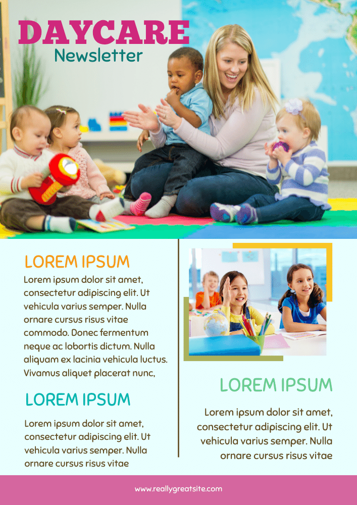
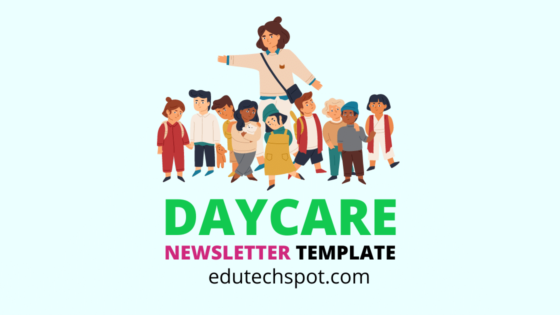
This daycare newsletter template comes with a large picture of a lady playing with babies in a daycare. The photo depicts how cheerful they are in the daycare. The activities enable them to connect to one another, learning new language, interaction, and social relationship among kids.
The bright blue color showing a world map makes the situation in the picture so fresh, telling that freshness of environment offered by the daycare.
As you can spot, the Daycare title begins with a very vivid pink color. The selected font for the title is bold to empasize the presence of the newsletter. There is also a smaller size text right under the header title. It is in teal (a bit green and a bit blue). These two colors (pink and teal) resonate with the surrounding colors. As you can see, the footer block is dominated in pink. That means, this design and the color selection provides balance across this page.
If you are running a daycare business, and you want to provide newsletter to the related parties such as parents, and other corresponding personal, you can consider using this template. However, you need to make sure that you can provide a suitable and high quality photograph to make the newsletter look standout.
Daycare Newsletter Samples
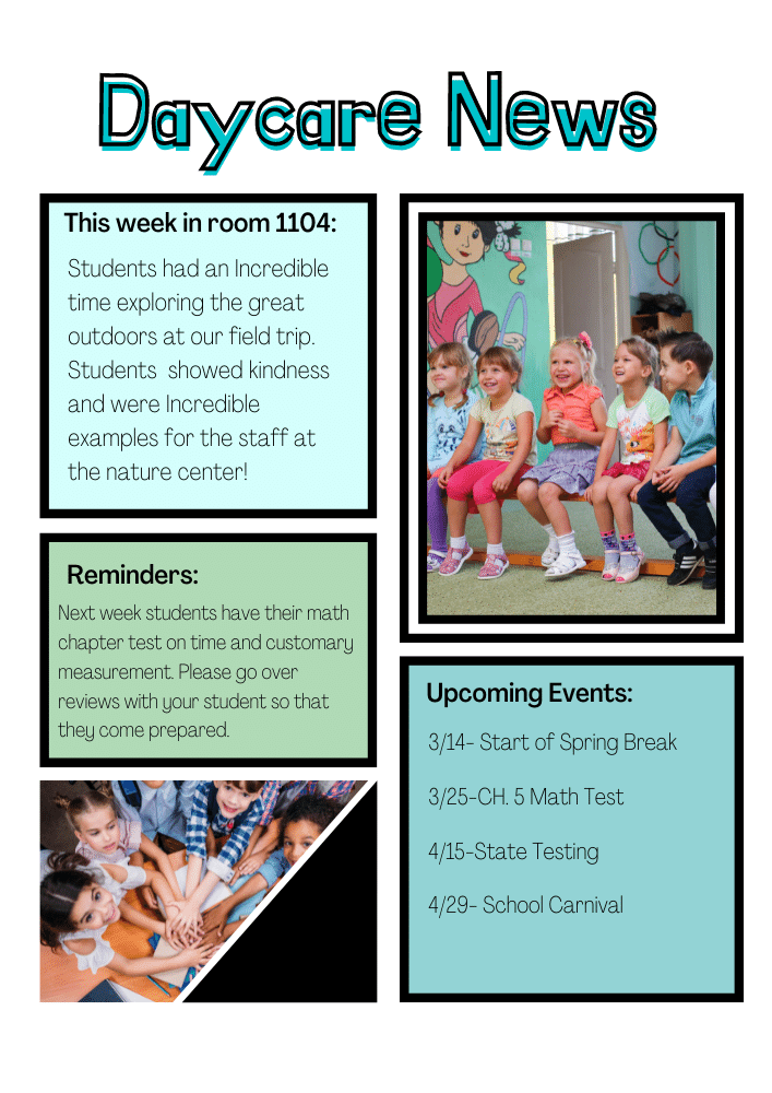
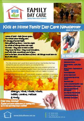
This daycare newsletter sample comes with a very simple design. It looks so minimalist, but it brings the simplicity of the live in the daycare.
Simplicity and minimalistic do not always correspond to trivial things. Simplicity and minimalistic, in the setting of daycare, can mean honesty and innocence. The live of kids are full of honest, trust, and innocence. This means that the news brought by the newsletter is reported as it is. There is no bluffing or made-look-fancy reports. More importantly, the text content focus only the most valuable information to parents about their children.
The good thing about simple design is that you don’t need to spend more time with the look of the newsletter page. All you want to do is to write the information. If you are that type of person, you can always count to this design.
Free Printable Daycare Newsletter Templates
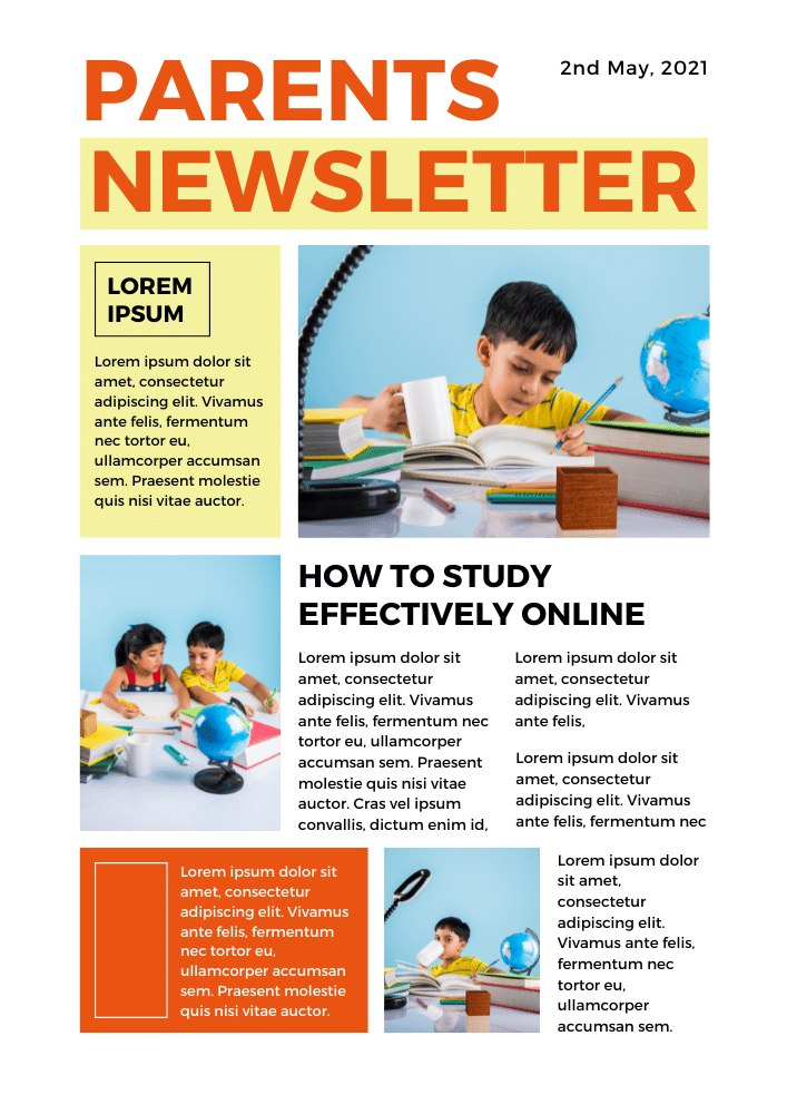
While every newsletter template offered in edutechspot.com is in digital version, they are actually for printed purposes, and thus; they are printable. This parents newsletter template begins with a large headline “parents newsletter” in capital letters.
You need to change the title if you have another title more suitable to your need and more representative to the information you deliver through the newsletter.
The second row is divided into two columns, about 35% for the left column, and 65% for the right column. The left column is for a short information, probably summary of a recent activity. This small summary can be illustrated using a photo on the right column. If you come into a question why the photo get bigger space than the text, you may consider a saying “a photo is worth a thousand words”.
However, that notion is not a rule of thumb, or a must. Check out the next row. The photo is presented in a smaller size than that of the text part. That means, the presentation depends on the purpose. In this case, the designer purposively layout the position of the image and text between what is in the upper row and the following row alternately.
child care newsletter samples
