Tri fold brochure template.ppt in powerpoint format is loved my many people because it is easy to edit in computer PC using Microsoft Powerpoint application.
Tri fold brochure template powerpoint
The following is a blank tri fold brochure template in powerpoint format that comes with guides and description so that you have clear idea on how to edit it using powerpoint. Here is the picture and the download link.
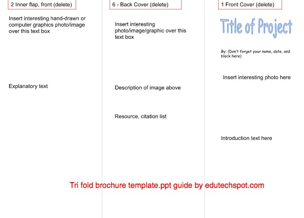
The first panel is commonly used for displaying Title of the project of the brochure. The title can be anything prepared by your team. You can discuss what title should be put in the first page. It is important to have a luring title for your brochure because interesting title in the first page of the brochure is seen first by the readers, thus it has to capture the attention of the reader so that they want to read more.
You can insert an interesting photo to strengthen the message of the brochure. The picture also needs to be inline with the title. The image must not oppose the message that the title tries to convey. The photo can be positioned in the middle of the page horizontally and vertically blocking the middle part, or a certain size that you consider visible enough.
In the first panel you can show an introductory text that summarise the whole content offered in the brochure. That said, you need to have a good summarising skill so that the introductory text can effectively represent the main message of the brochure.
And here is the other side of the tri fold brochure page:
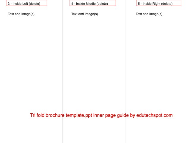
The other side of the brochure contains panels for positioning in inside left, inside middle, and inside right. The naming of the positioning in the template must be deleted. Those are just guides so that you know where your information should be put and you can predict how it would look like when folded.
The inside left (3) and the inside right (5) are covering the the inside middle (4). You can fold 3 first and then followed by the 5 to cover number 4. All these three panels are unseen when folded because they are inside.
The content of the inside parts are mostly images and text describing the image and possibly some headings. The inside part mainly explains and provide thorough information needed by the reader. It is quite different from the function of the panels that are set to appear outside.
Simply put, the outer part is the attention gatherer, and the inside part is the explainer.
Get yourself familiar to this tri fold brochure template that you will edit in powerpoint. Here are the six parts that you need to get used to:
In short, here are the three parts of the first page:
- Front Cover
- Back Cover
- Inner Flap, front
And here are the three parts of the other page:
- Inside Right
- Inside Middle
- Inside Left
6 Panel Brochure Template
Tri fold brochure is also known as 6 panel brochure. Thus, if you are looking for 6 panel brochure template, or 6 pages brochure, you are actually looking for tri fold brochure template. Tri fold brochure has six panels or pages.
Powerpoint Brochure Template Free Download
So you are ready to download this tri fold brochure template.ppt ? Here is the link to download in your computer so that you can edit it later based on your preference. Here is the link:
If you are interested in other types of brochure templates that can be edited in both powerpoint and Google Slides, you can get them here: Free Brochure Templates for Google Docs.
It’s always fun to create a brochure.
FAQ on Tri Fold Brochure Template Powerpoint
To make a trifold brochure in powerpoint, all you need to do is to create a new powerpoint document in a printable size paper such as A4, F4, Letter, and any paper size that you want. Then, divided it into three columns equally so that you can put your brochure information and pictures in each column.
There are so many brochure templates in powerpoint format. You can start with the blank template, or edit the existing brochure template with headings, text contents, and image.
You divide a brochure design into three columns by using table or using guide line to have equal size of three columns. 
A tri fold brochure creates 6 pages. 3 pages are in the first side, and the other 3 pages are in the other side.
The size that is commonly used in tri fold brochures are 8.5″ x 11″ for letter format. If you like to use the popular one, you can go with 8.5″ x 14″ or 11″ x 25.5″.
Tri fold brochure design can be used for various purposes for different industries. Most of them are restaurants, non-profits companies, real estate, manufacturers, and of course retail business.
Commonly, a trifold brochure is folded twice starting from the middle section. This type of fold creates six parts or panels so that more information can be chunked effectively.
In presenting your information in a trifold brochure, you need to maintain its simplicity so that your customers can have more information. Take advantage of a tri fold brochure panels for exposing product photo, description, services, and other promotional annoncements.
This page is focused on presenting how you can make use of a tri fold brochure template.ppt that we offer here. You can edit the blank template the way you like.
In editing, like when editing other type of template, you need to get familiar to the flow of the template. Editing this tri fold brochure template powerpoint focused requires that you understand the positioning of each panel from the six panels.
Editing powerpoint trifold brochure template is easy because in fact powerpoint is easy to use. If I should choose between creating brochure template whether to use microsoft word or powerpoint, I would choose powerpoint.
Now that you have arrived here, I proudly serve the ppt brochure templates free to use. After reading all necessary explanation so that you know how to use the template, you can get it soon.
Using this powerpoint blank tri-fold brochure template, you can create unlimited designs. You can promote you business easily. Although this is a very basic layout, this is really powerful in helping you create the best brochure design you always imagine.
You have full control over the layout, items, colors, and nearly everything that shape effective yet elegant looking brochure. You can insert your company logo. Personalise every photo that represents the best offer of your business to your potential customers.
In fact, using blank design, you can use it for various purposes like simple company profile, product promotion, product launch, sales promotion, and any type of publication to reach other parties.
For some people, it true that using blank design is preferred because they don’t want to be limited by the design that is already presented. Most of the time, this type of person does not find that the template is not suitable to his/her objective, styles, and tastes.
Brochure design does not have to be artistic. As long as it effectively promotes and conveys its main goal, it is a good brochure.
However, this must not be used generally, because some field of business do require fancy design brochure that uses fancy colors, complex layout, professional photography and anything professional to bring the most out of the brochure capability to reach potential customers.
Tri-fold Brochure Templates in Powerpoint: Examples
Below are some examples of tri-fold brochure template that may inspire you. You can create the same fancy try-fold brochure in powerpoint by using the blank template that you get above. Here are some possibility that you may achieve:

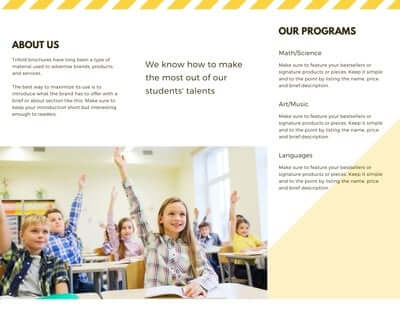
This yellow focused and dominated trifold brochure powerpoint based is an example of what you can achieve using the blank template above.
The first panel comes with the title “The School Name”. The middle one, that will serve as the backside of the brochure, is a straight forward message for the reader to contact the business owner.
The bottom place is dominated with a large and wide photo of children learn together happily. This image portrays how children can learn effectively yet with fun way during their participation in the school.
Your business can do the same as what the sample brochure does. All you need to do is to adjust it to your business need and main offering.
If your business happened to be the same, that is a school, you can use this template right away. If your school main color is green or other color like red, you can simply change the color based on your need, a color that represents your school. It does not have to be yellow.
In the back side, there is an about us panel, followed by a quote text that brings the philosophy of your school or business. The right panel is for listing the programs or services offered.
There is a photo that takes two panels bottom space. If you don’t like the way the photo put, say that you want it to only in one panel, go a head. There is no golden rule here.
The above try-fold brochure design is available in powerpoint and google slides. If you want to download the powerpoint file and used it as a template, here is the download link:
